Fragmented experience
Inconsistent screens and clashing interactions frustrated users.
Case studies / Connect and Heal
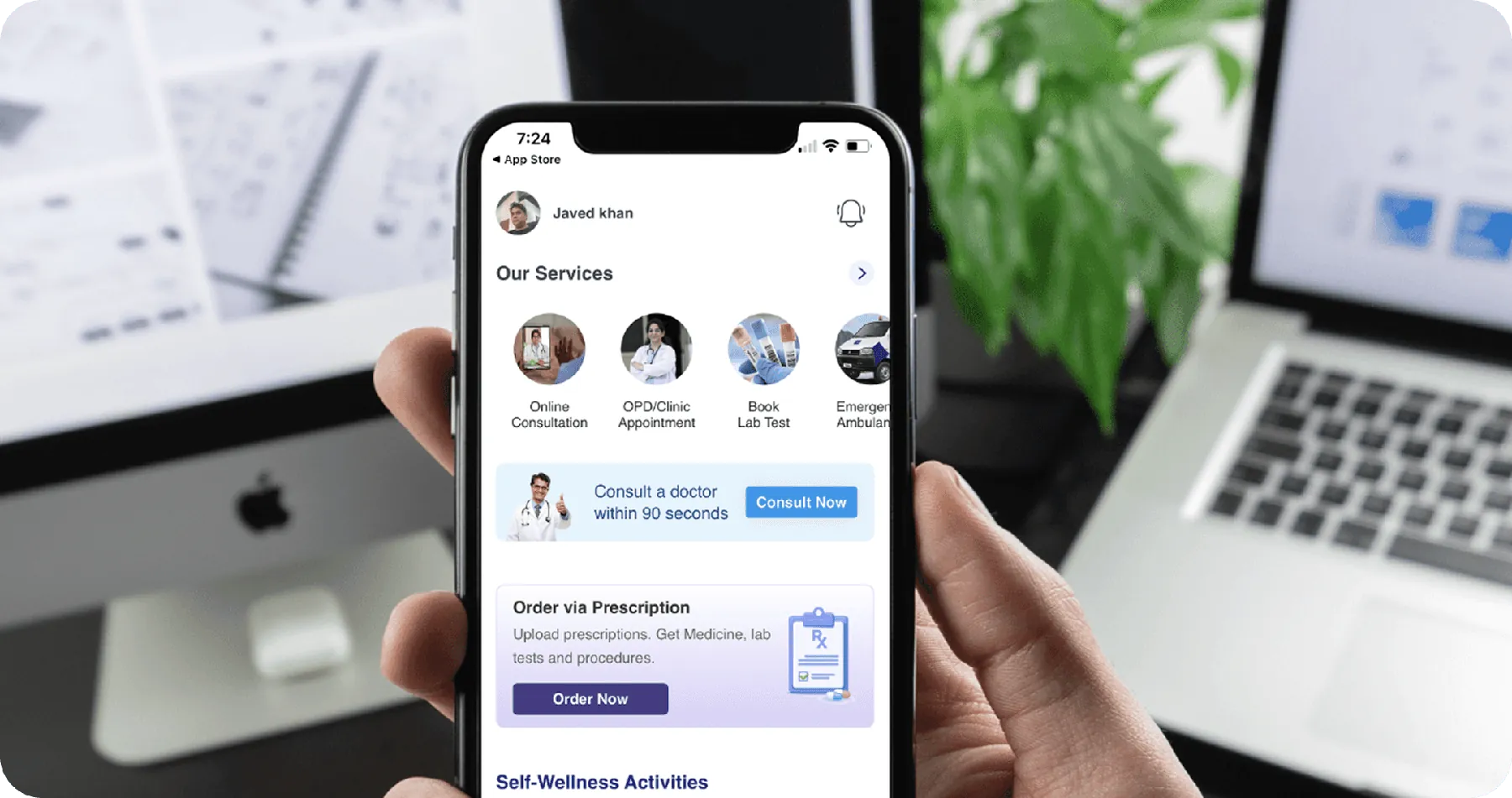
App redesign for service discovery and personalised care
Connect and Heal offers complete family healthcare, from consultations to wellness. I reimagined the app so patients find the right service fast and get care that fits them, while building the design system and team to keep it consistent.
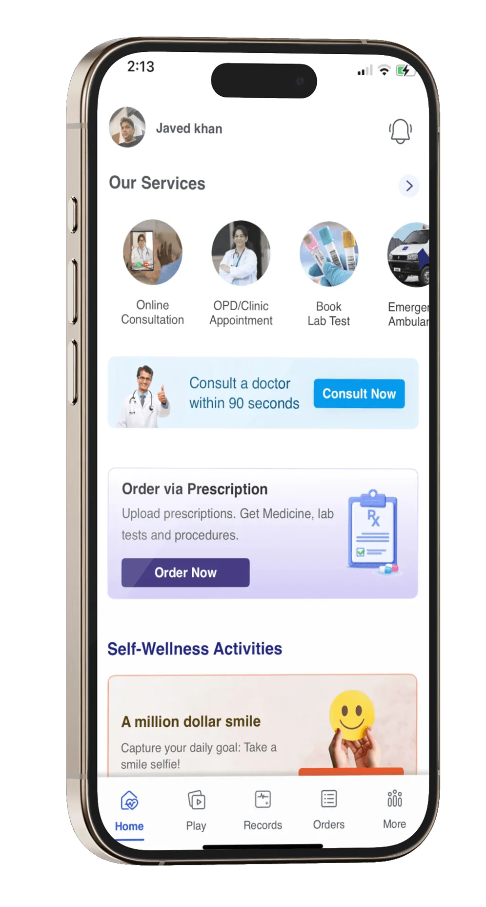
A fragmented app with no design system, siloed teams and a 40% drop off in onboarding was slowing growth and flooding support.
30% Head of Design, 70% hands on. Built the prioritisation model, ran stakeholder alignment and coached a two person design team while delivering.
Clear navigation and booking flows, personalised health content, and a scalable design system shared by design and engineering.
172% growth in daily active users, 50% faster booking, 20% less front end effort and 35% fewer usability support requests.
I dug into stakeholder conversations, analytics, heuristic reviews and real customer calls. Six problems stood out.
Inconsistent screens and clashing interactions frustrated users.
Without a scalable system, every change was slow and inconsistent.
Business, product, tech and support worked in isolation.
Convoluted flows caused confusion and a flood of support requests.
A rigid approach made every iteration slow and expensive.
Two designers without the structure for a redesign of this scale.
To balance tight timelines with limited resources, I built a UX prioritisation model and split my role: 30% Head of Design for strategy and alignment, 70% individual contributor to speed up delivery.
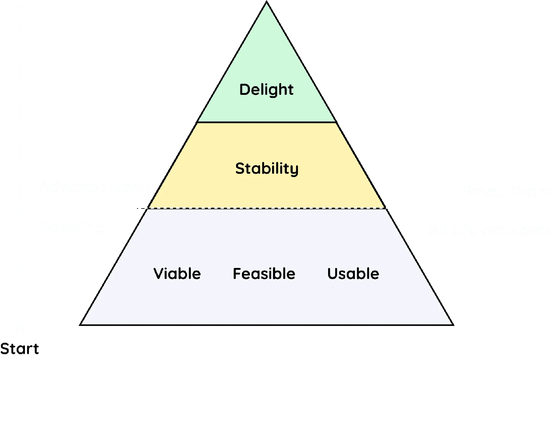
Every design needed sign off from design leads, product owners, legal, tech, accessibility and security. Diverse feedback made it slower, but the result was well rounded and compliant. It made the biggest difference on sign up, which became smoother, more accessible and more secure.
Aligned with stakeholders upfront to anticipate concerns and cut back and forth.
Fewer people in the room, and a coordinator to keep discussions focused.
Chat for quick questions, meetings for critical decisions, email for the record.
MoSCoW kept the team on high impact issues, not minor polish.
Research, usability data and real examples built confidence.
Strong relationships with decision makers resolved disagreements quickly.

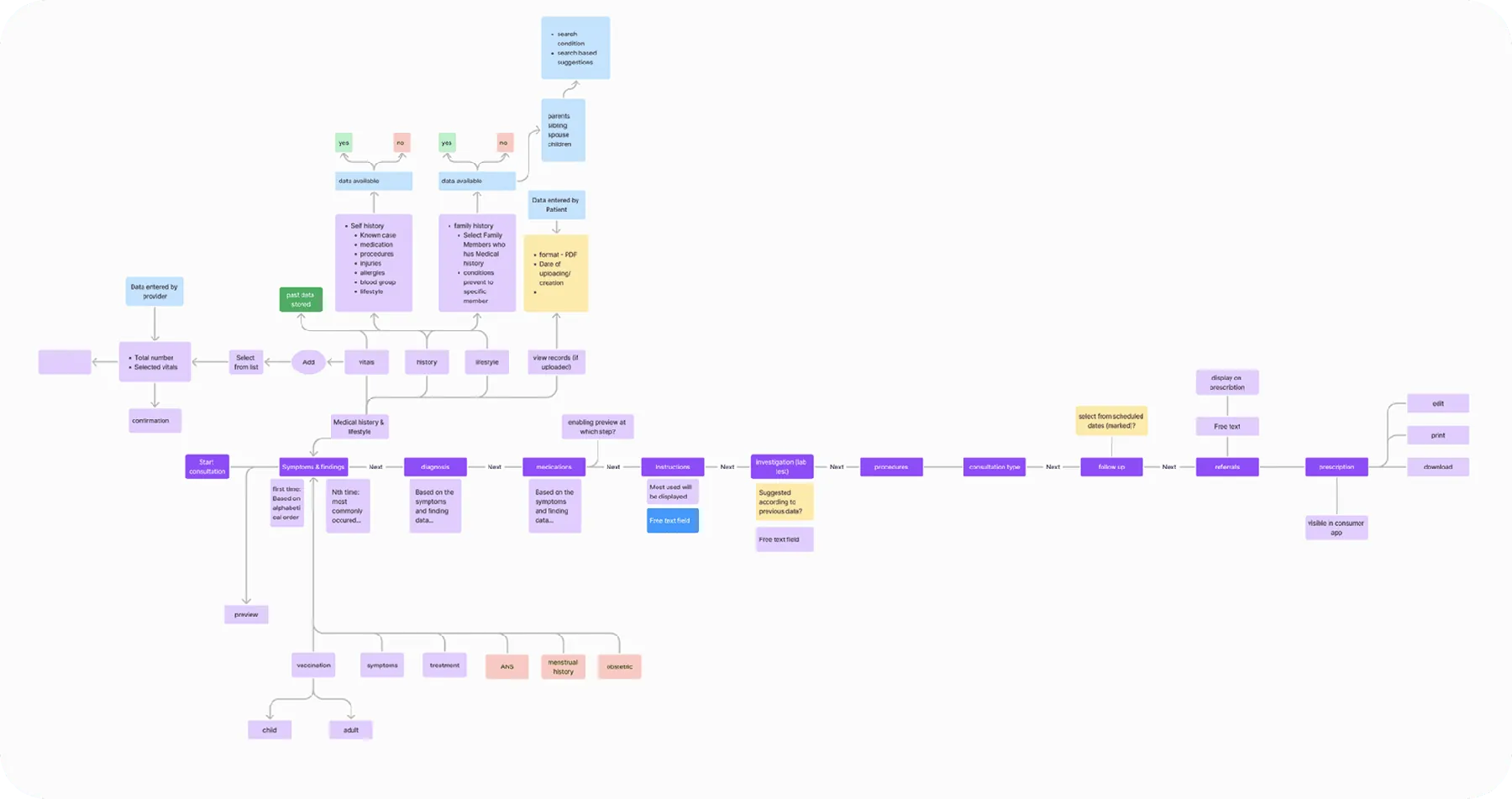
First 2 weeks
The goal: ideas that lift the customer experience and open new business opportunities, without being limited by today's technology.
Next 4 weeks
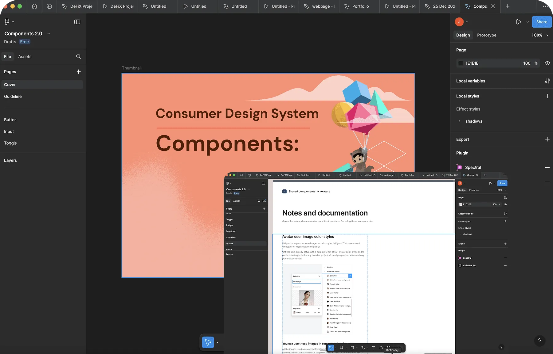
A scalable kit of reusable components cut design time by 50% and kept the platform consistent.
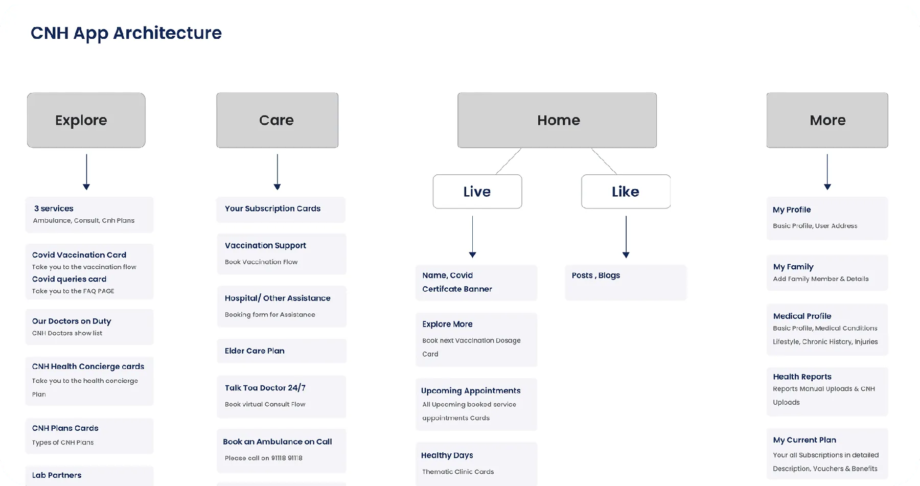
Simpler workflows and clearer navigation lifted task completion by 40%.
A modern, cohesive visual system strengthened the brand, built trust and improved readability, with 25% more engagement.
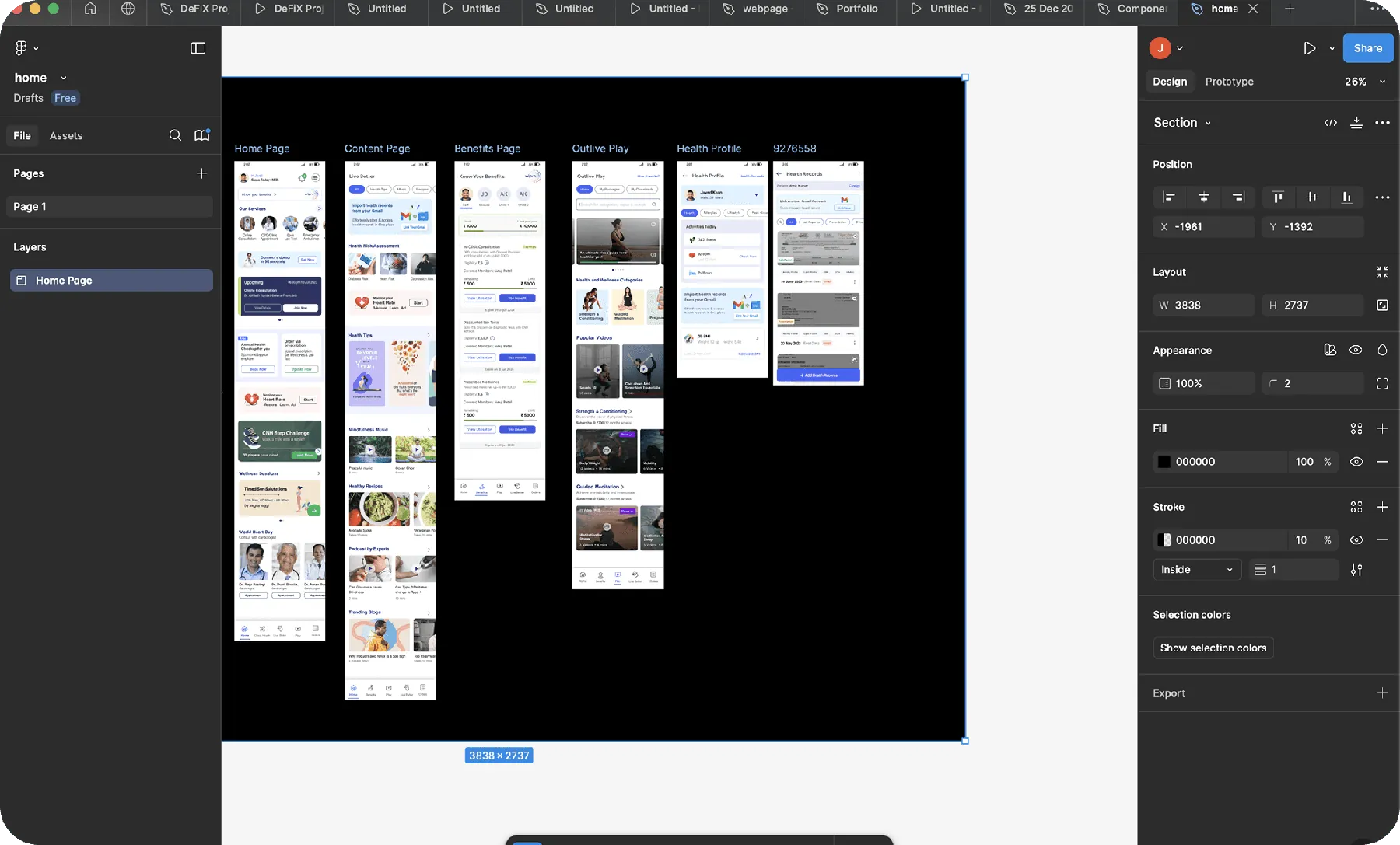
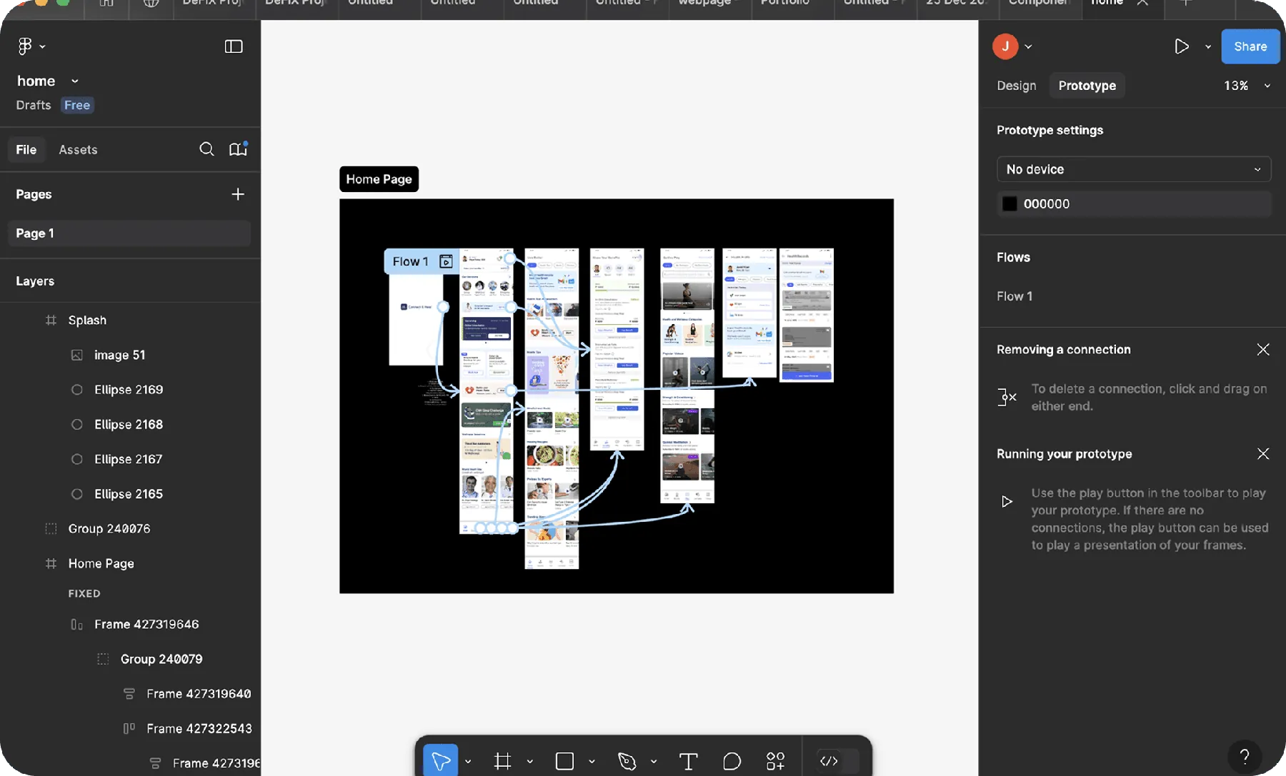
High fidelity prototypes got early stakeholder feedback and avoided costly rework in development.
Usability tests with real users refined the design and cut usability related support requests by 35%.
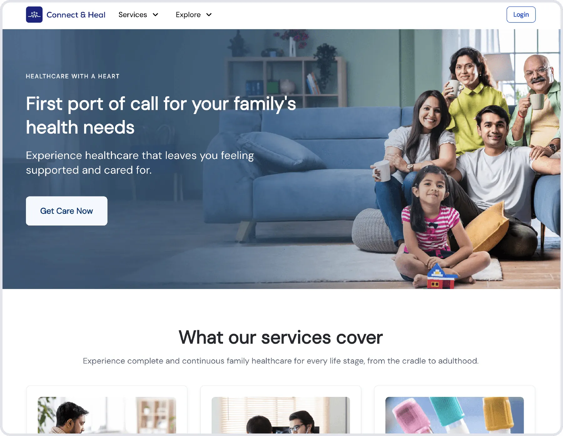
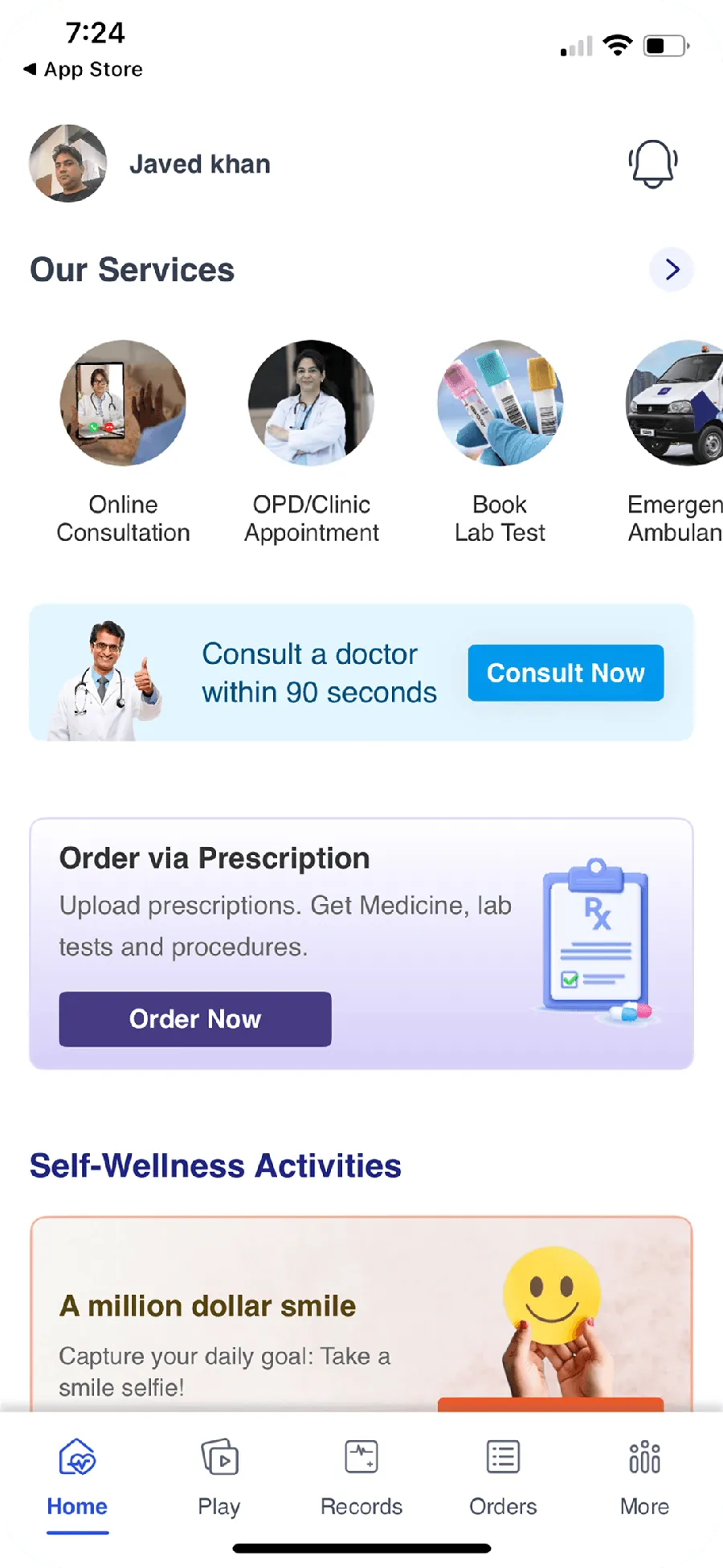
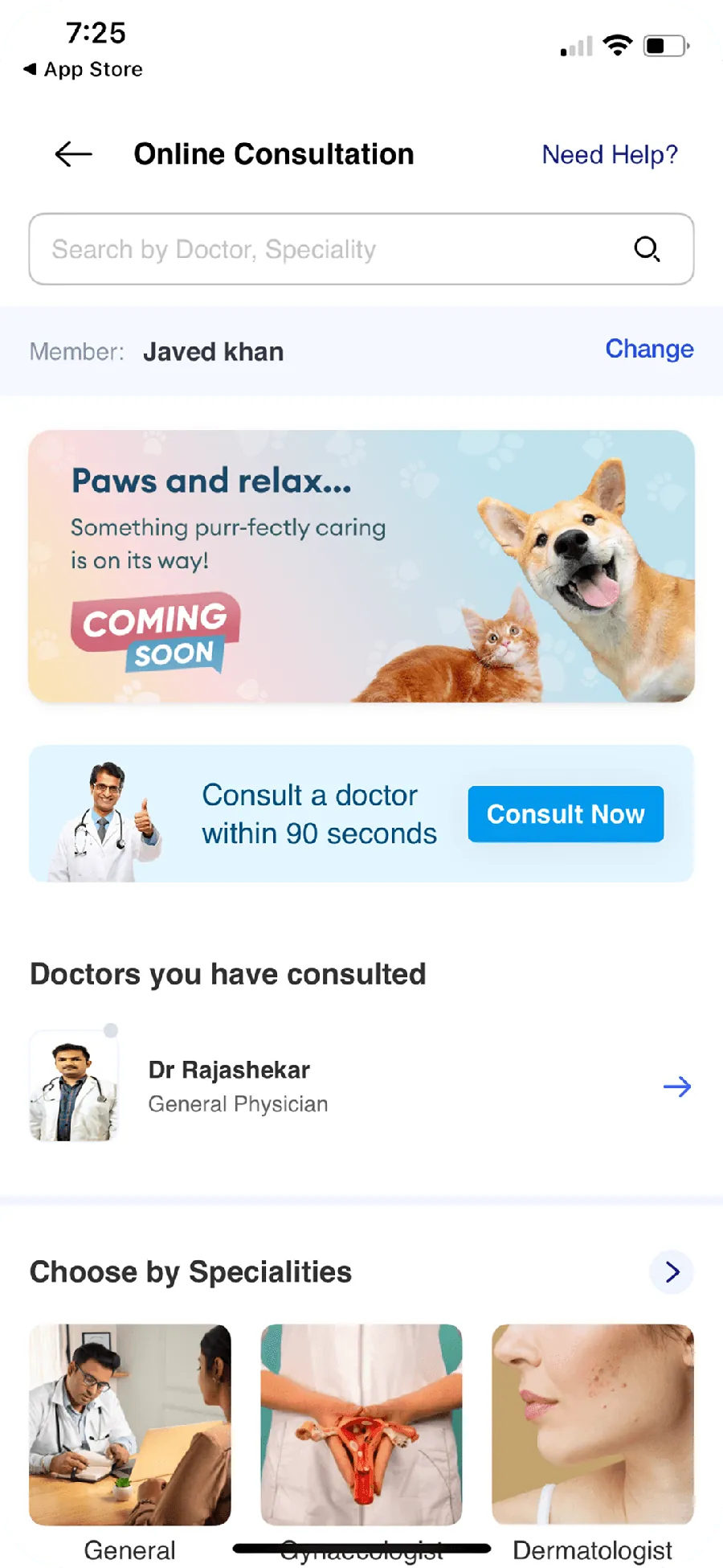
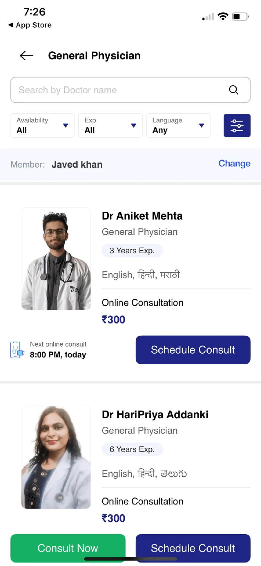
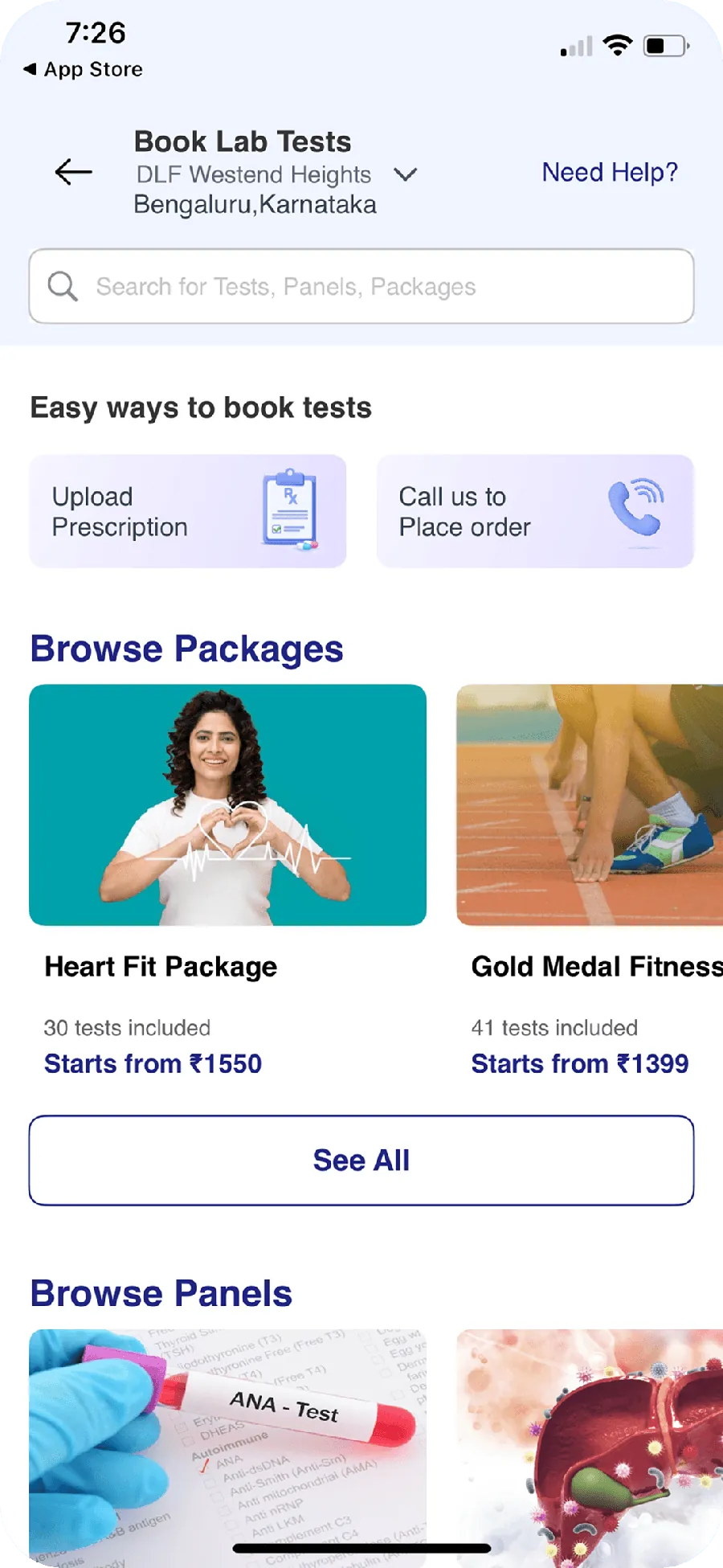
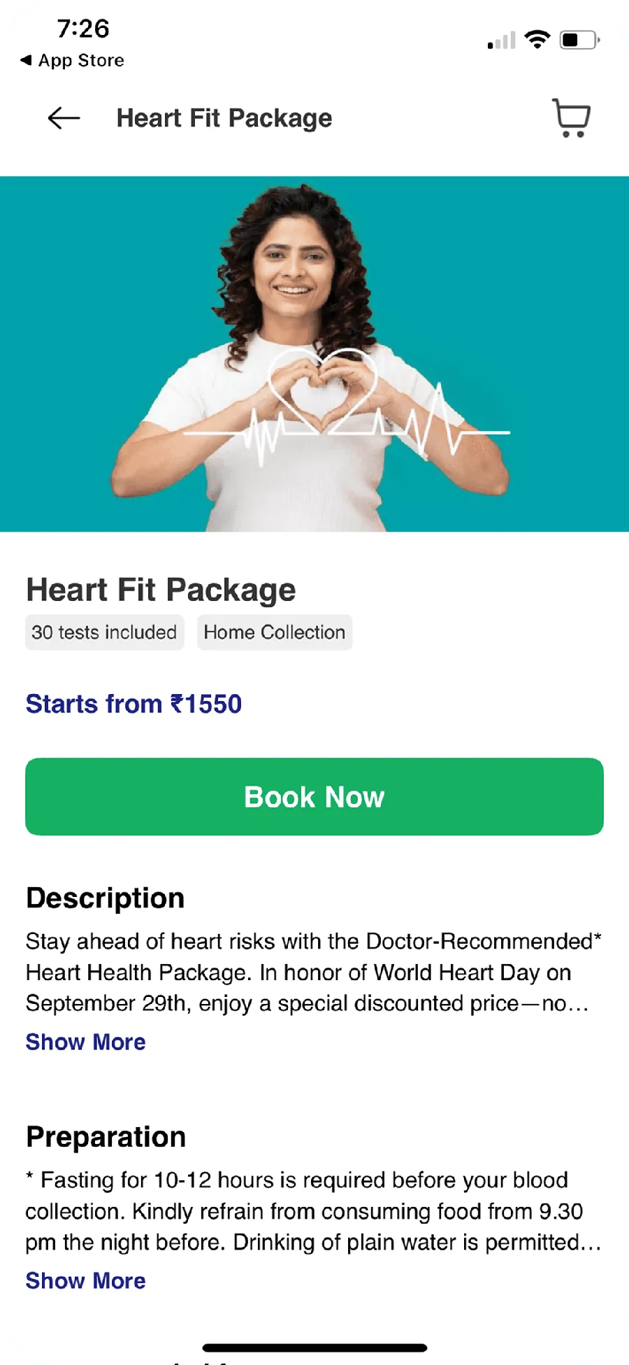
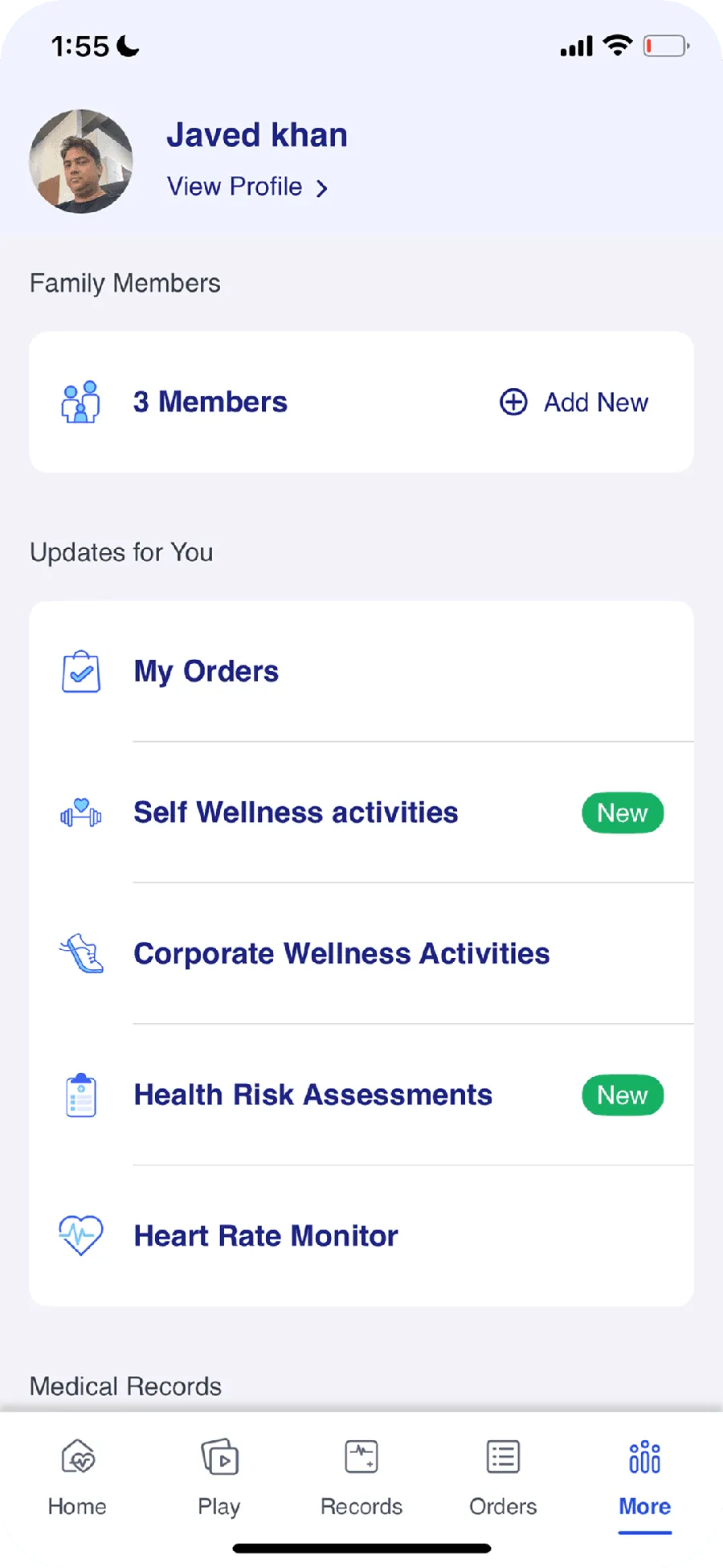
Practical choices over theory: layout, typography, hierarchy, and small shifts in spacing and contrast that make an interface feel effortless.
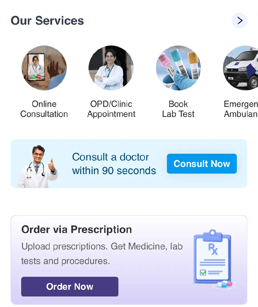
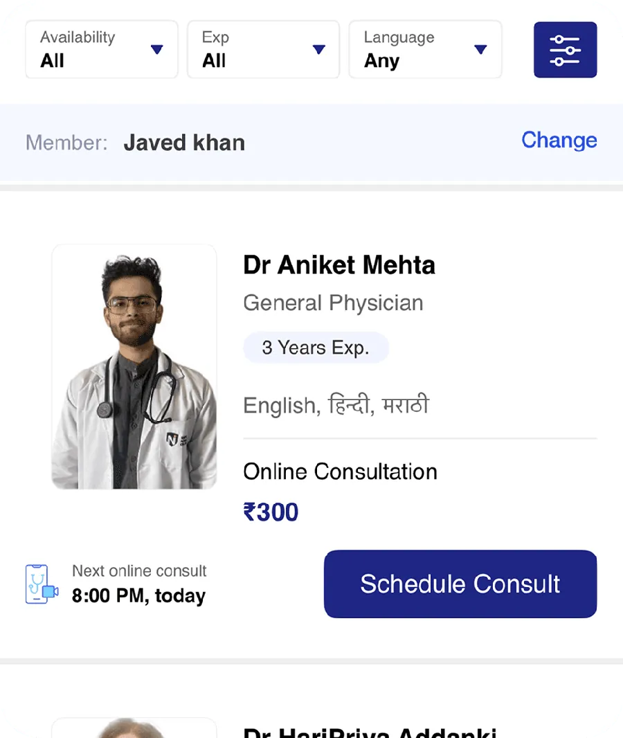
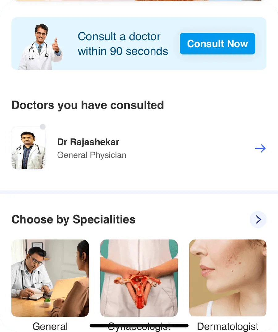
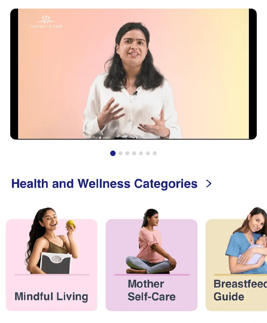
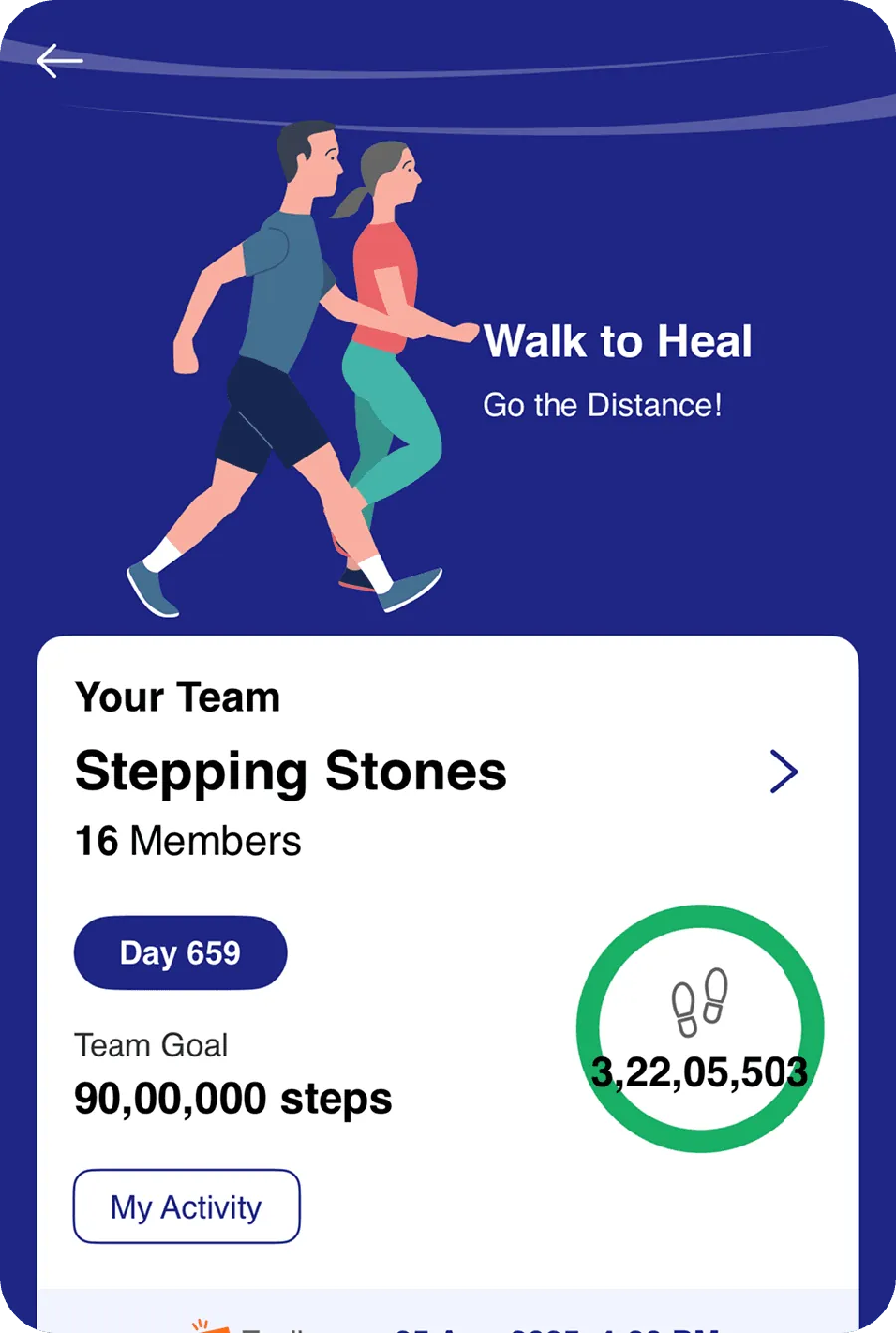
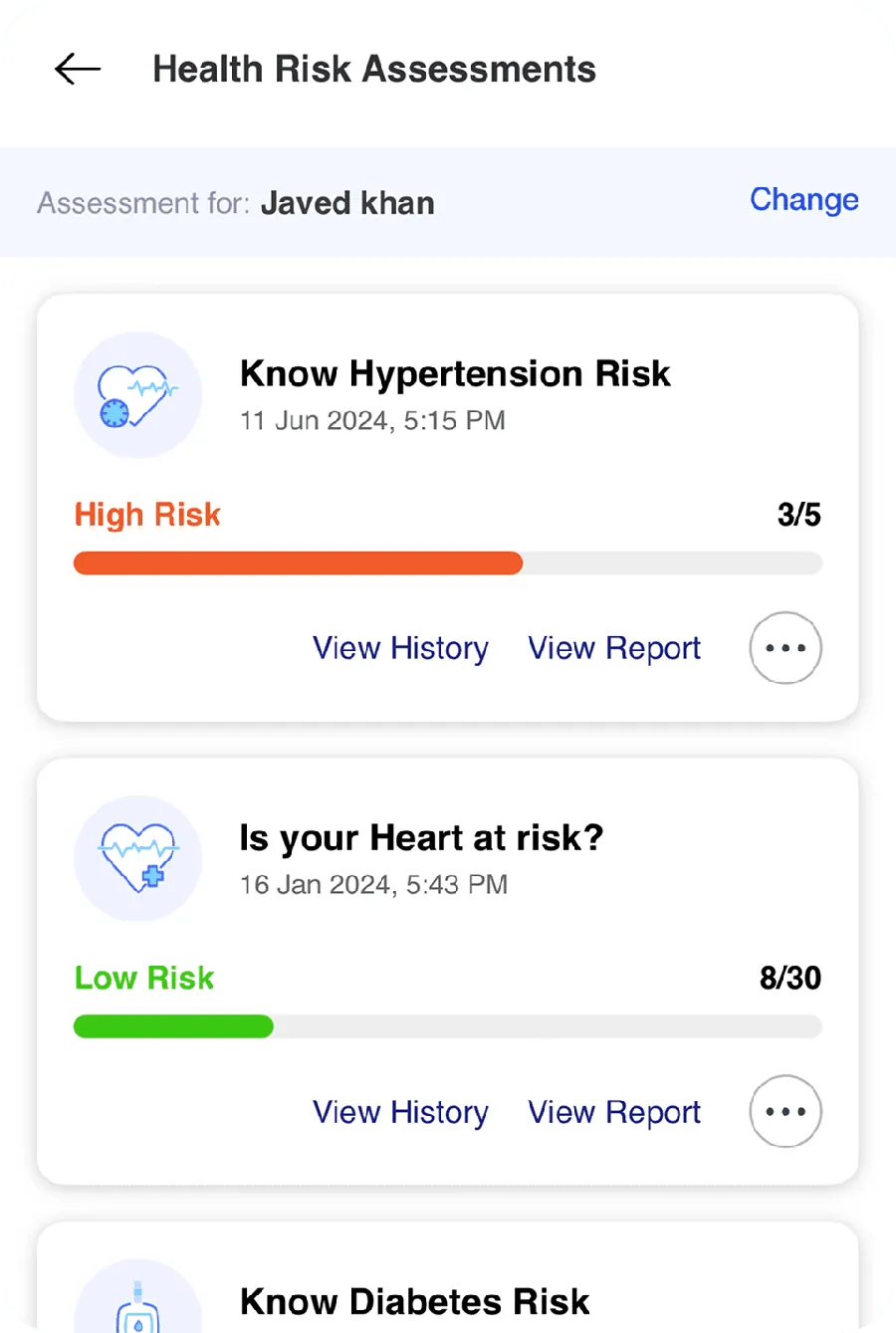
A flexible design system lets new features land without redesigning from scratch.
Small interactions and clearer cues made booking smoother and lifted conversions.
With a moving roadmap, experience let me make quick, confident calls without losing quality.
30% Head of Design for vision, 70% hands on for speed and quality.
Set expectations and structure aligned cross functional teams and removed bottlenecks.
Data backed choices and rapid iteration led to faster approvals and better usability.
Understanding how patients search, book and follow up shaped every flow, from onboarding to reminders.
Simplifying complex workflows and building a system early pays off with every release.
Prioritise, iterate quickly and let real feedback confirm the call.
Analytics and A/B tests refined usability and lifted conversion.
172% growth in daily active users, 50% faster booking, 20% less front end development effort and 35% fewer usability support requests.
He split his time 30% as head of design and 70% hands on. He built the prioritisation model, ran stakeholder alignment and coached a two person design team while delivering.
A fragmented experience with no design system, siloed teams, complex workflows and a 40% drop off in onboarding.
Design and engineering shared one scalable system, which made screens consistent and cut front end effort by 20%.
Fix UX friction, design AI that users trust, unlock up to 5x growth. Get a free UX assessment.