Fear of failure
Stakeholders were understandably cautious. Millions of people relied on the app to move money every day, so any misstep could hurt trust and the business.
Case studies / MobiKwik

App redesign, enhancing discoverability, scalability and experience
What started as a simple digital wallet evolved into a feature rich financial powerhouse. With seamless UX, intuitive design and expanded financial services, MobiKwik now offers bill payments, credit, investments and more, in one smarter financial experience.
A 2.5 year old design was capping growth: services were hard to find, users dropped off at key steps, and new products like UPI and loans had nowhere to live.
Design lead of a 3 person team, from research to delivery. Aligned product, engineering, business and marketing on one roadmap.
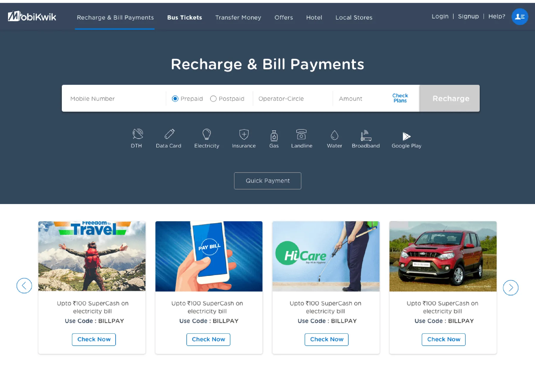
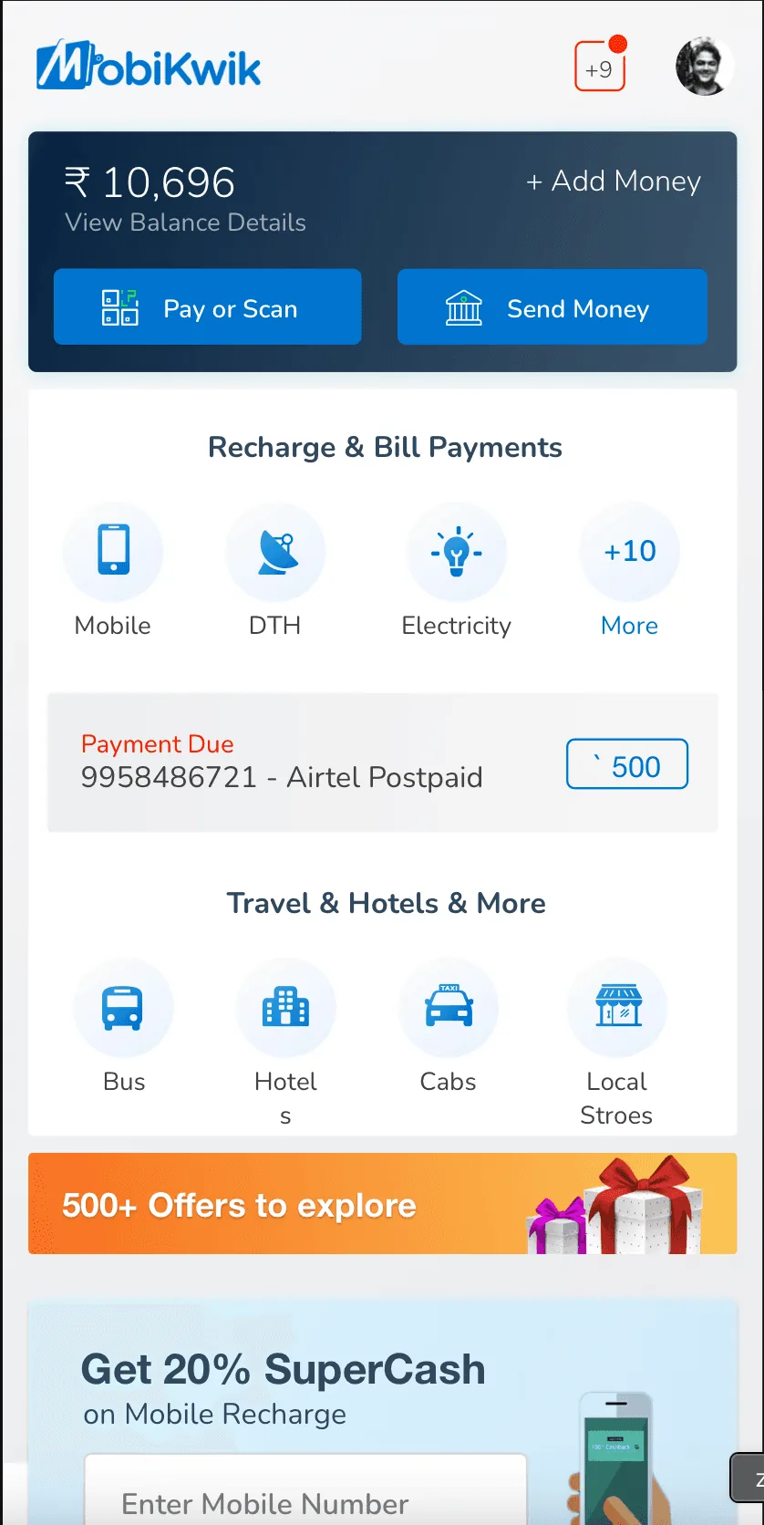
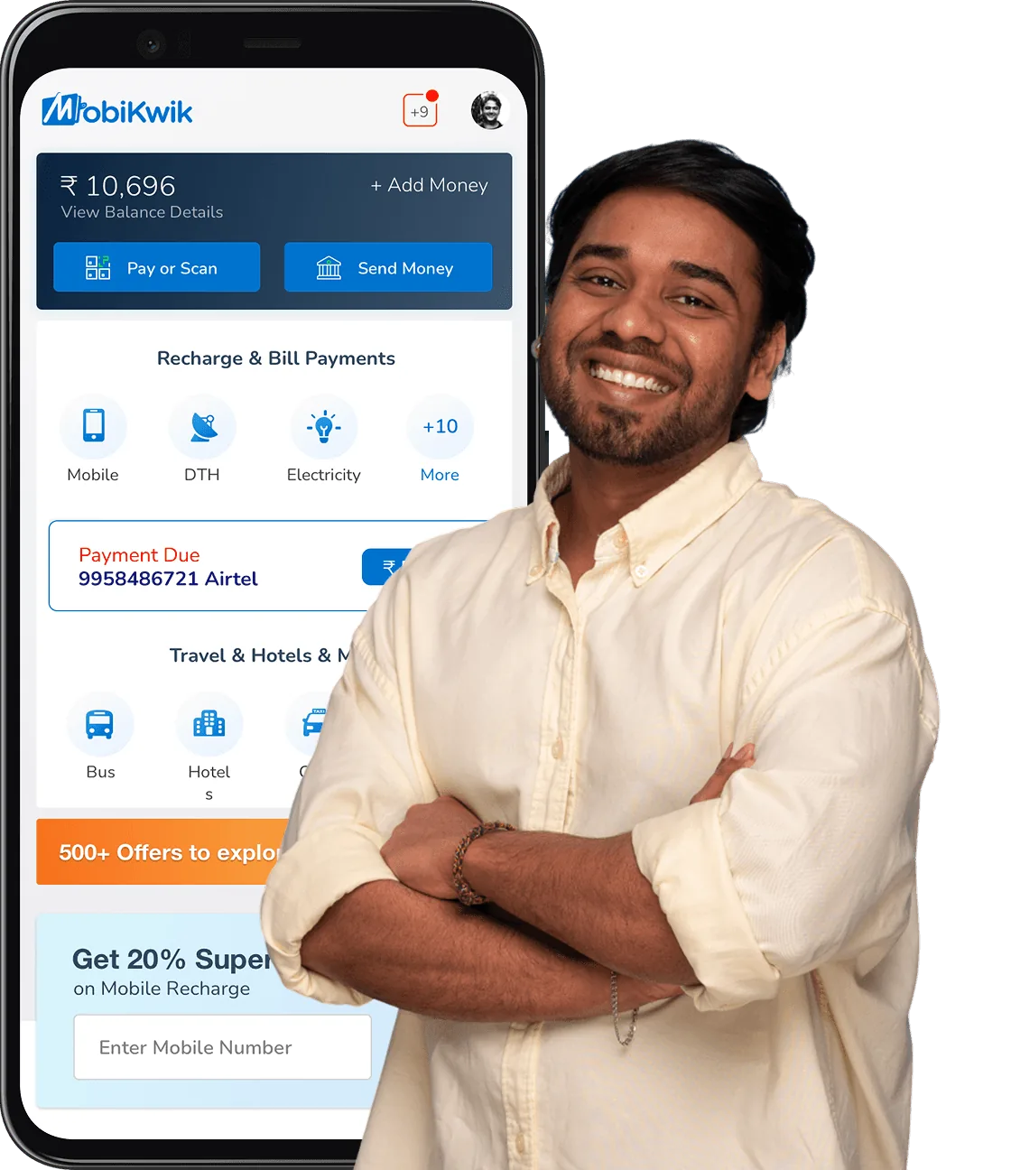
Home rebuilt around every service, modular service blocks for faster launches, a design system that halved design time, and trust patterns in money flows.
42% better service discoverability, 25% fewer transaction drop offs, 60% UPI adoption growth in 45 days, and 11 new features shipped during demonetisation.
A 2.5 year old design that was hitting scalability hard and restricting product growth. No sync between product, development and marketing. Full of confusion, with very limited usage. Even basic features like mobile recharge were under used.
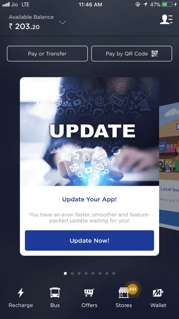

After 2.5 years of product stability, it was time to scale in experience and offering. We identified several friction points that needed solving.
Stakeholders were understandably cautious. Millions of people relied on the app to move money every day, so any misstep could hurt trust and the business.
Users expected payments to be instant, safe and effortless, with every service one tap away, even as the product kept growing.
Users and stakeholders came with long lists of requests, often conflicting, making it hard to identify what truly mattered and what would drive the most value.
The real challenge was focus: impact over volume. We filtered out the noise, streamlined features and designed for what moved users and the business.
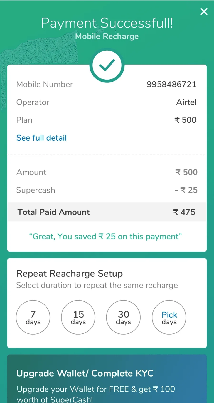
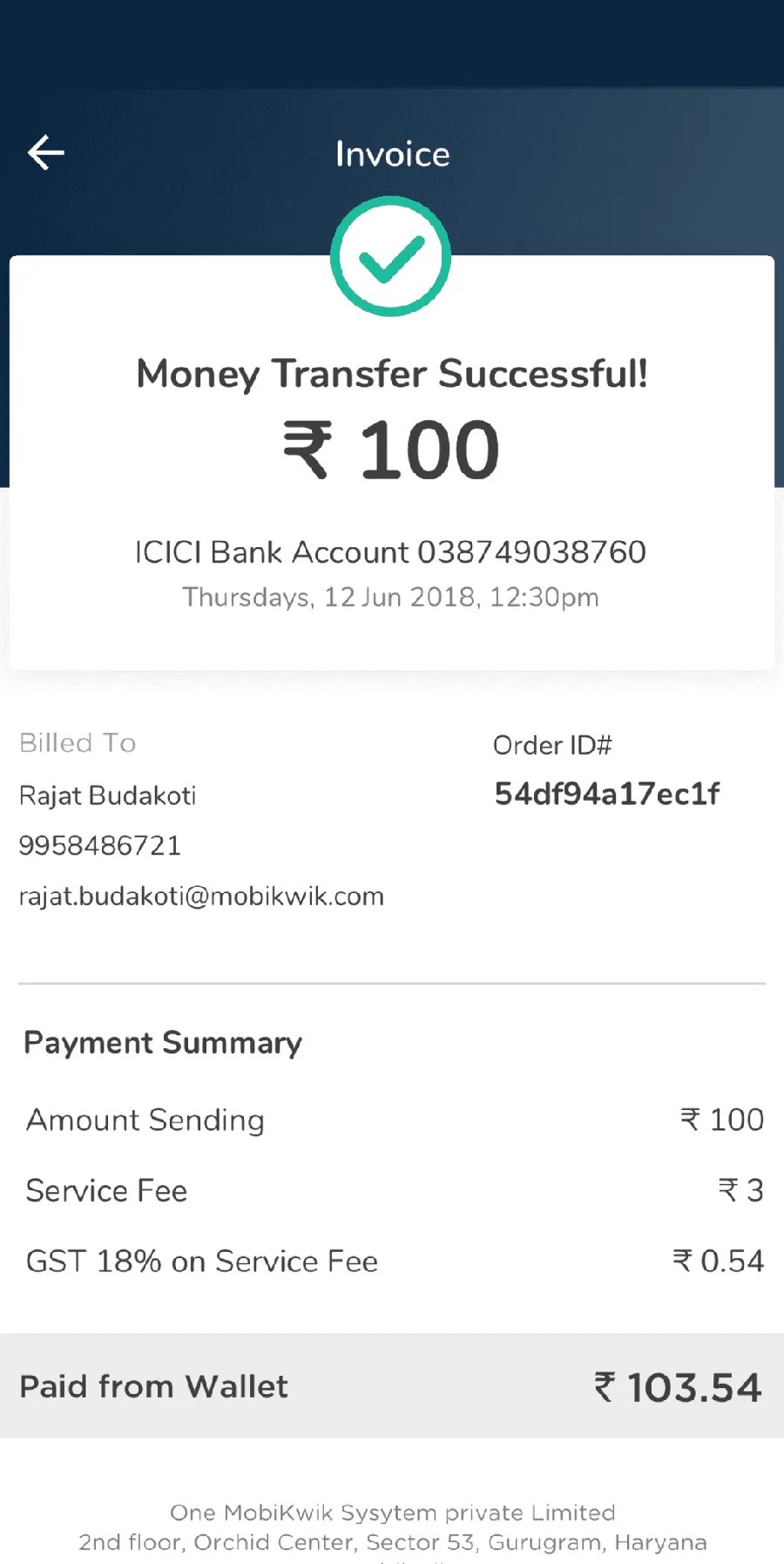
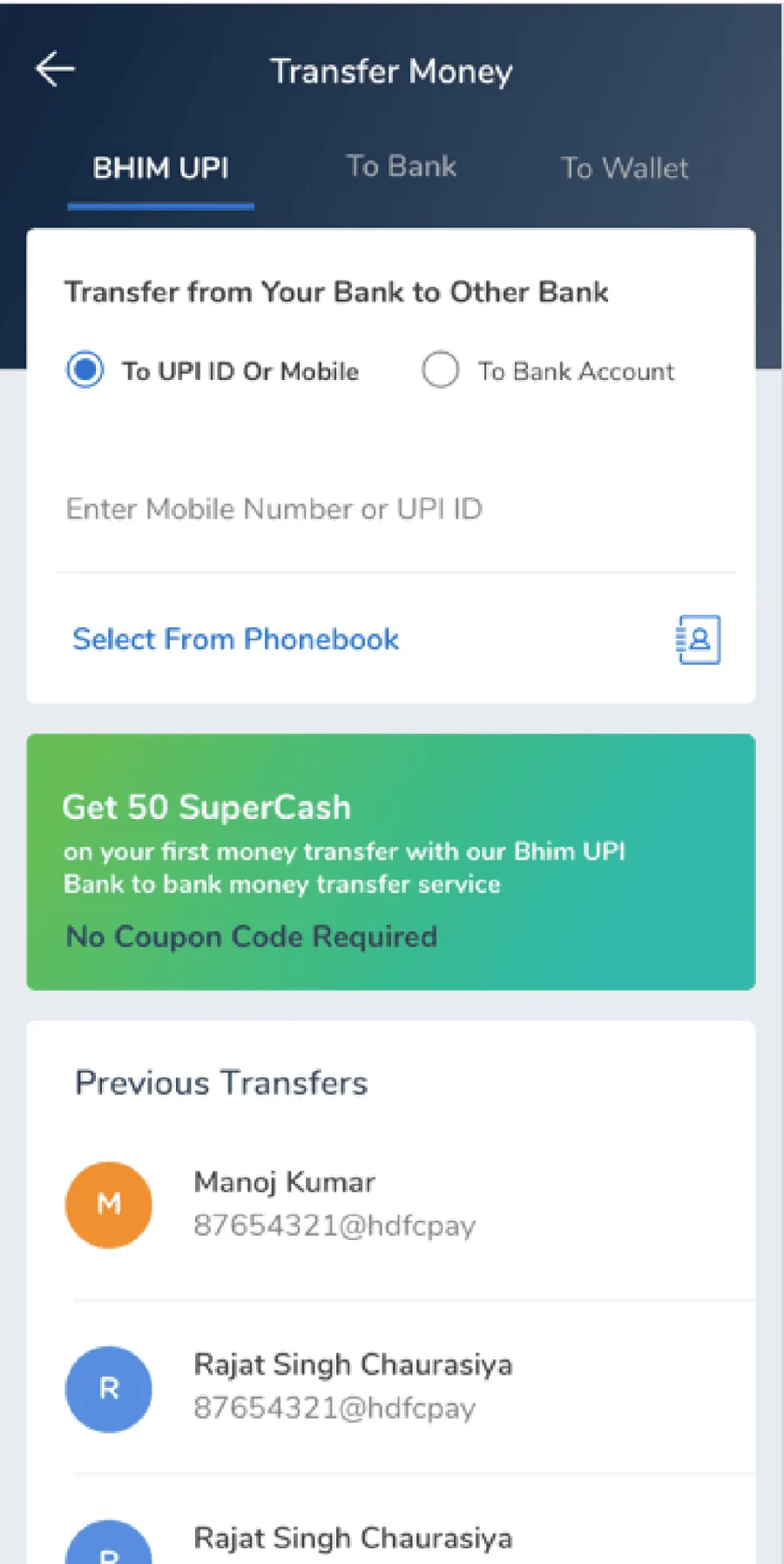
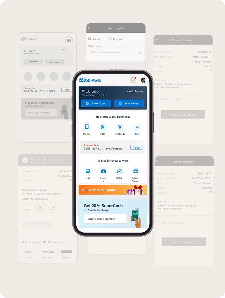
To redesign MobiKwik, I started with user research to identify issues and drop offs. I changed the navigation so all services live on the home page, adding components for new features like UPI and hotel booking. Personalisation and discoverability created a faster, cleaner experience.
Along the way I involved product, engineering, business and marketing to align priorities and tackle challenges, so decisions met both user and business needs. This teamwork led to a solution everyone felt confident about.
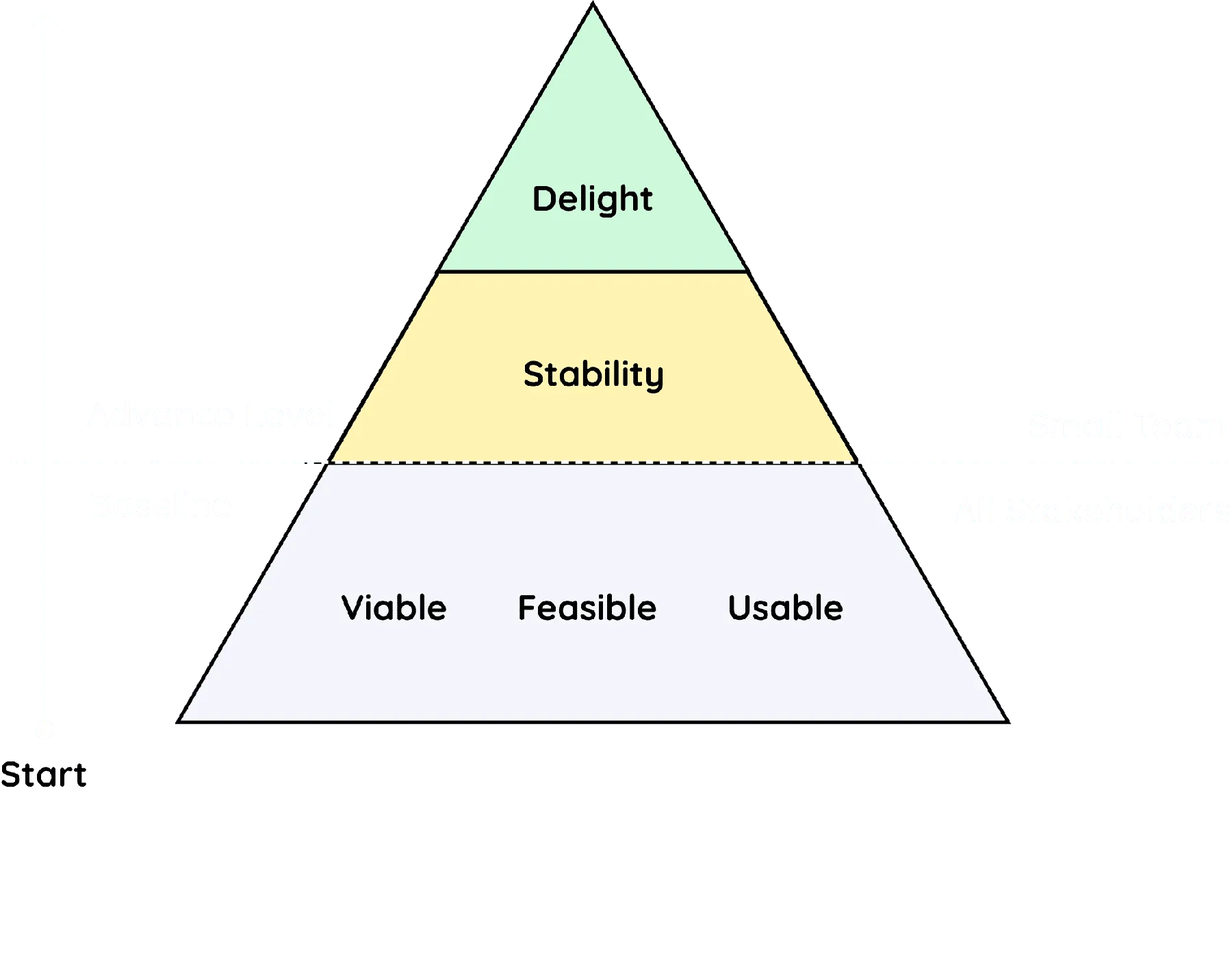

As design lead in a focused 3 member team, I drove the product's transformation from vision and user research to delivery and iteration. My role spanned strategic planning, hands on design and stakeholder alignment.



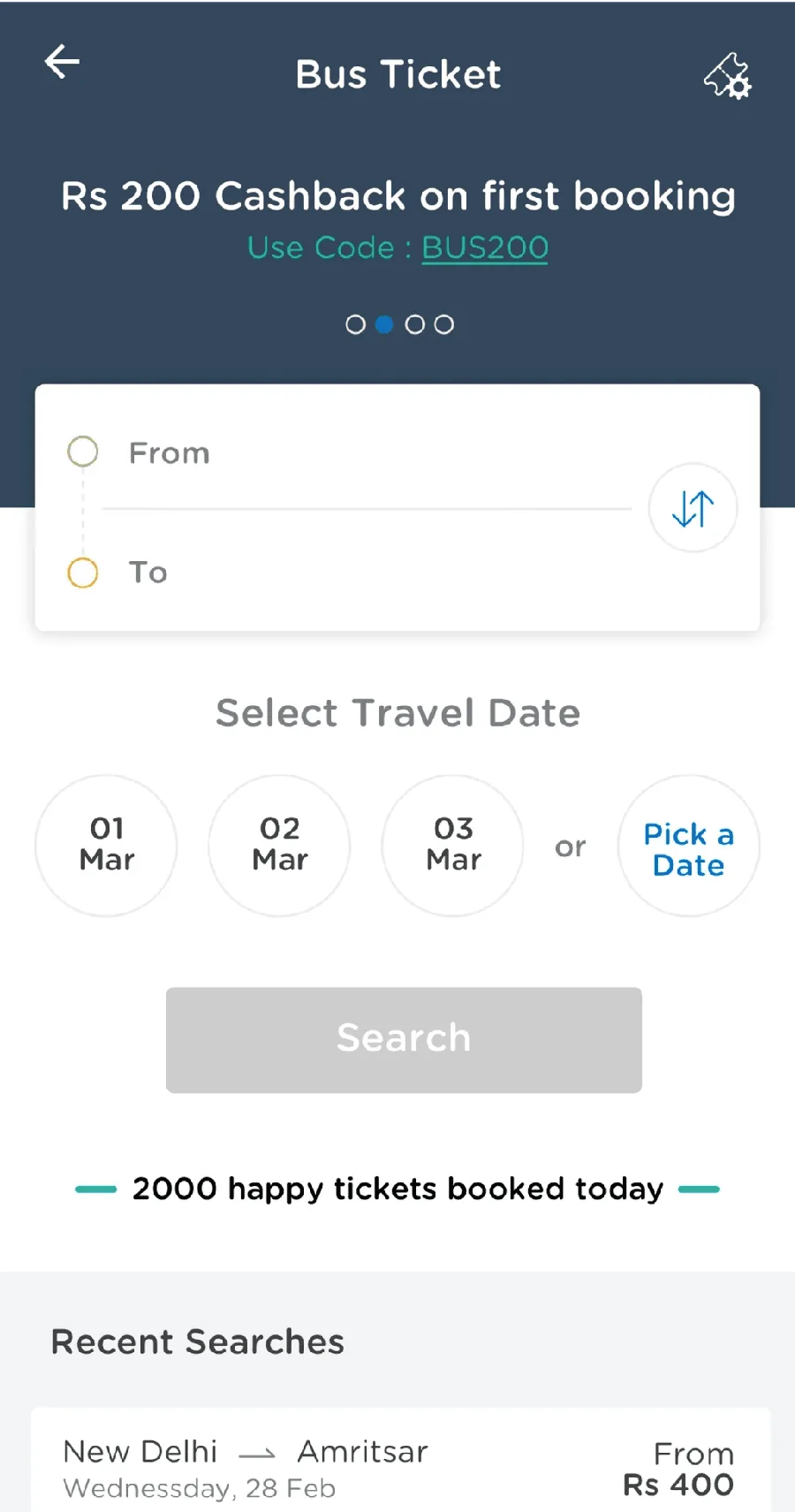
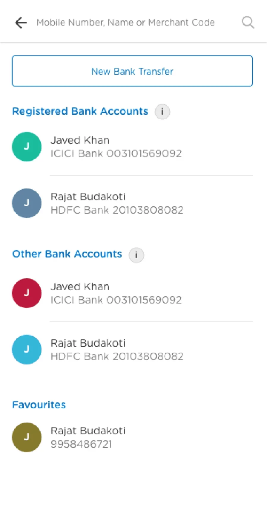
Launching Gold Loans, UPI, Microfinance and Bus Ticket Booking was not about a service and a fancy UI. It was about making them valuable, viable and scalable.
I worked with stakeholders to define why each feature mattered. Revenue? Retention? Supporting underserved users? This tied design decisions to real business goals.
Close collaboration with engineering helped assess feasibility early, avoiding dead ends and making sure flows like UPI payments or Gold Loan eligibility could scale across millions of users.
With product managers, I defined clear success metrics: completion rates, engagement levels and repeat usage. Design was not just beautiful, it performed.
Phase 1
Our goal was to imagine forward thinking solutions that enrich user experiences and spark new avenues for growth, free from the boundaries of existing technology.
Redesigning MobiKwik wasn't just a visual upgrade. It needed a deep understanding of how real users interacted with financial tools, and where they faced friction, confusion or drop offs.
Reviewed the existing app against Jakob Nielsen's 10 usability principles to uncover friction in navigation, feedback and flow.
Spoke with users across Tier 1 and Tier 2 cities to capture a mix of digital literacy and expectations.
Few responses, but enough to validate the need for smart nudges and repeat reminders.
Phase 2
We aimed to generate innovative ideas that elevate customer experiences and unlock new business opportunities, free from technical constraints.
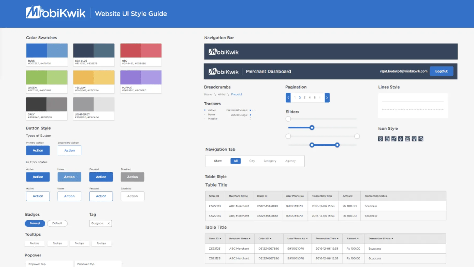
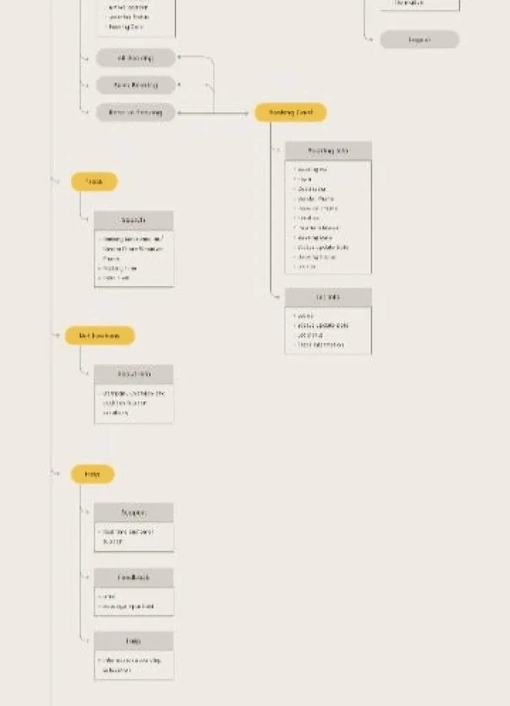
A modern, cohesive design system that unified the visual language across platforms. Consistent components, typography, spacing, iconography and interaction patterns reinforced the brand and improved usability, with focus on accessibility, readability and responsiveness.
25% increase in user engagement, measured by interaction depth and repeat sessions.
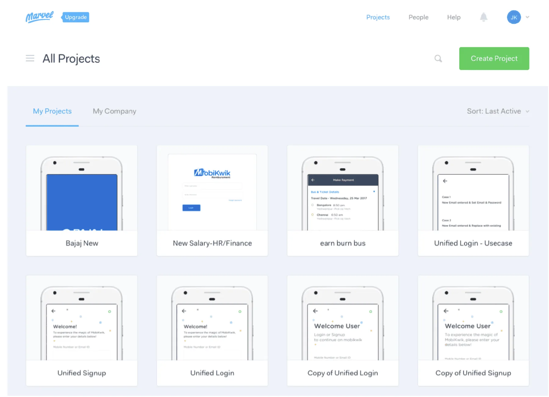
High fidelity prototypes in Marvelapp validated concepts early, gathered quick stakeholder feedback and aligned cross functional teams, cutting rework and costly iterations in development.
Usability testing with real users surfaced friction in task flows. Refined key interactions and simplified navigation.
22% fewer usability related support requests and better overall satisfaction.
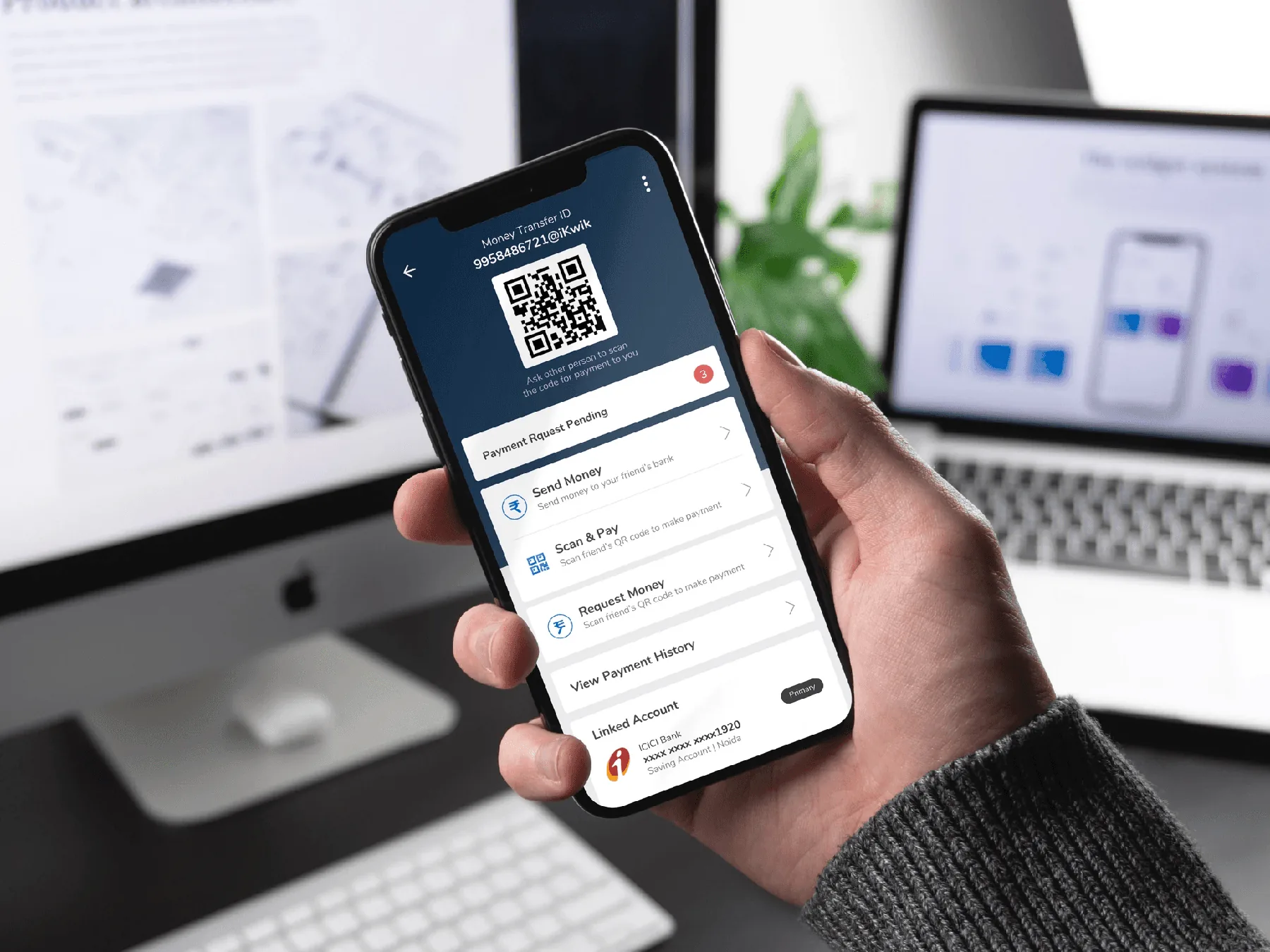
42% better service discoverability, 25% fewer transaction drop offs and 60% growth in UPI adoption within 45 days. 11 new features shipped during demonetisation.
Design lead of a three person team, from research to delivery. He aligned product, engineering, business and marketing on one roadmap.
A 2.5 year old design was capping growth. Services were hard to find, users dropped off at key steps, and new products like UPI and loans had nowhere to live.
Home was rebuilt around every service with modular service blocks, and a new design system halved design time for new features.
Fix UX friction, design AI that users trust, unlock up to 5x growth. Get a free UX assessment.