76 components
Inputs, overlays, navigation, feedback and data, each documented with real scenarios.
Case studies / xparticle
xparticle: a design system product for data storytelling, shipped with docs, Figma and an MCP server
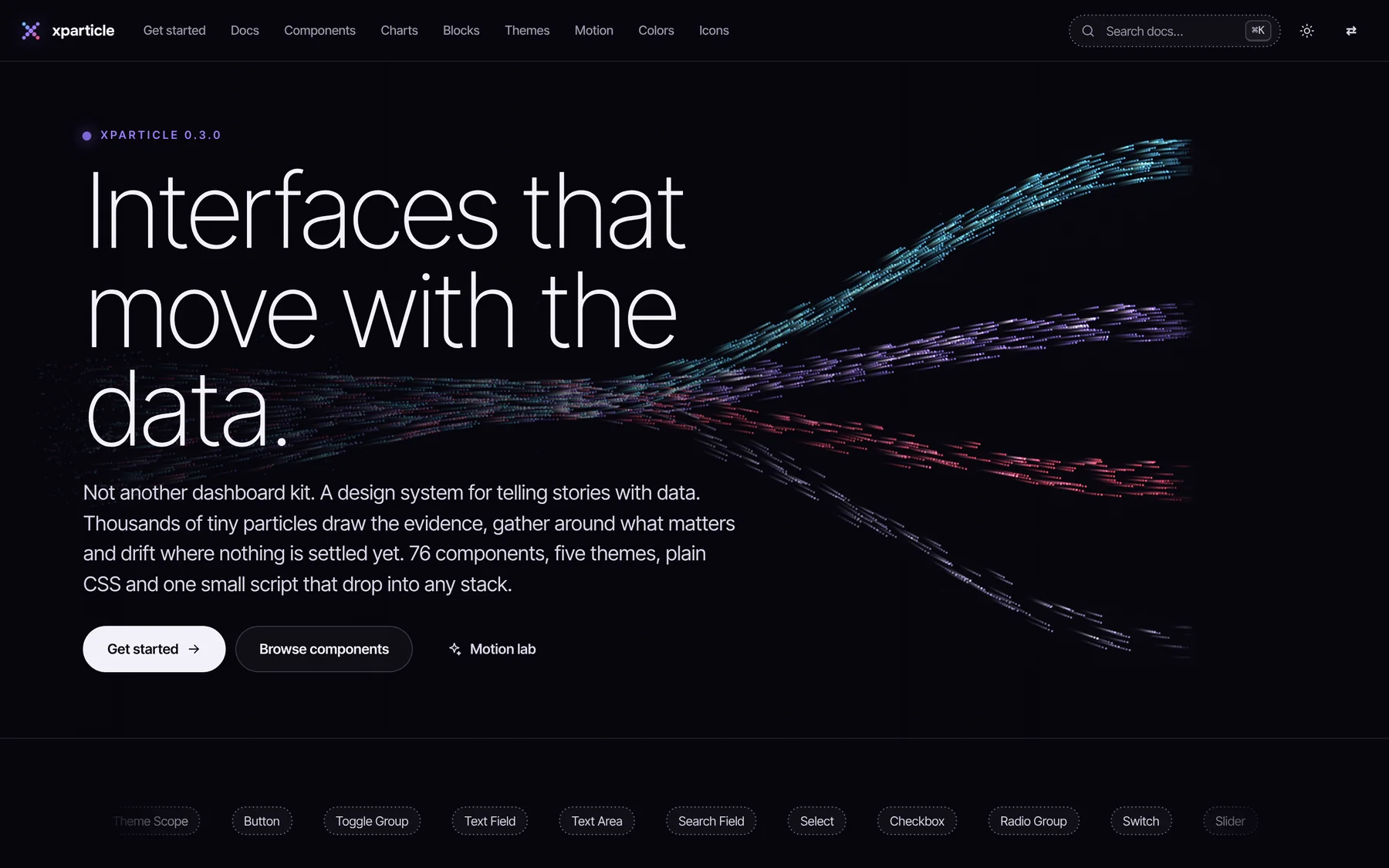
Most data screens show everything and leave people to find the point. I designed xparticle so every screen leads with one headline and one number, shows the evidence as moving particles, and ends with a decision someone can make today.
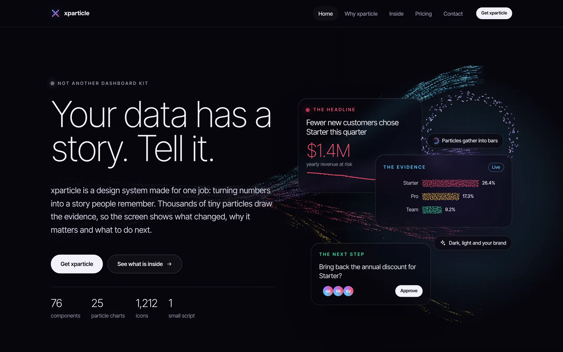
Dashboard kits are built for monitoring. In the meeting where someone has to decide, forty correct charts still fail to say what to do.
Designed the system end to end: the story structure, particle visual language, tokens, components, icons, documentation and the product website.
A design system with a point of view: headline, evidence, next step. Particles show change, and every screen ends with a decision.
Shipped as a real product: a free Core edition and a $79 Pro licence with a Figma file, an MCP server for coding assistants and design services on top.
Most design systems hand you a grid, a pile of charts and a filter bar. Great for monitoring. Terrible for the Monday meeting where someone has to decide.
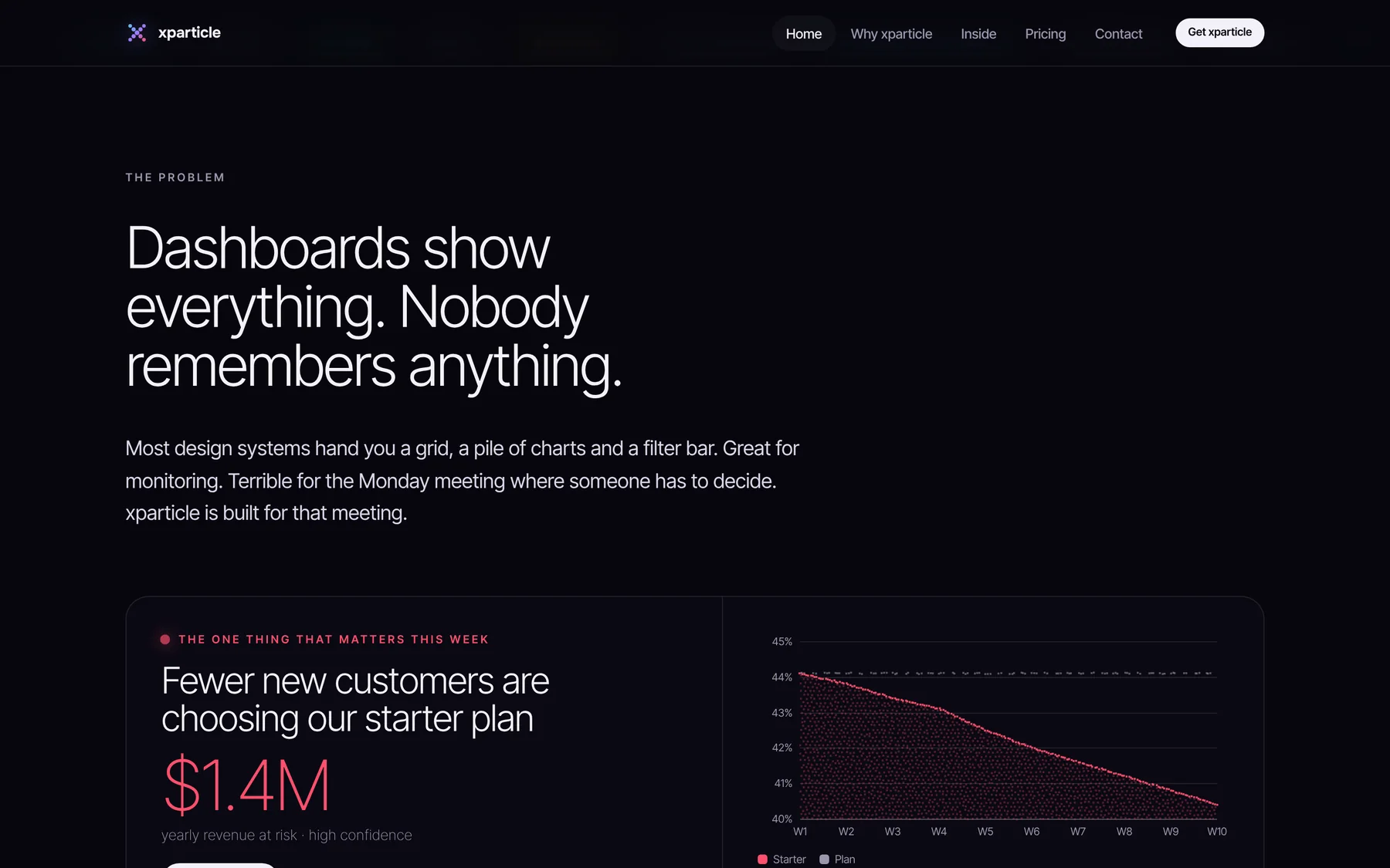
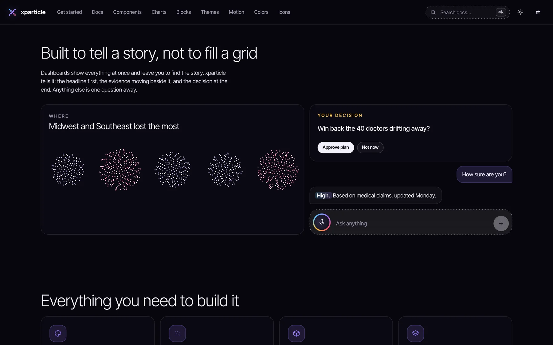
The core design decision. A story structure baked into the components, so teams build briefings instead of chart walls.
Say it in one sentence. Big type, one number, a live label when it is urgent. People get the point before they read an axis.
Let the particles show it. Points gather into bars, drift into a trend and fly between groups, so the change is easy to feel.
End with a decision. Approve, ask or assign. The system gives that moment its own components.
Movement is how people notice change. A bar that grows is easier to feel than a number that changed. Particles gather, split and drift between states, and when motion is not welcome they hold still and the chart still reads.
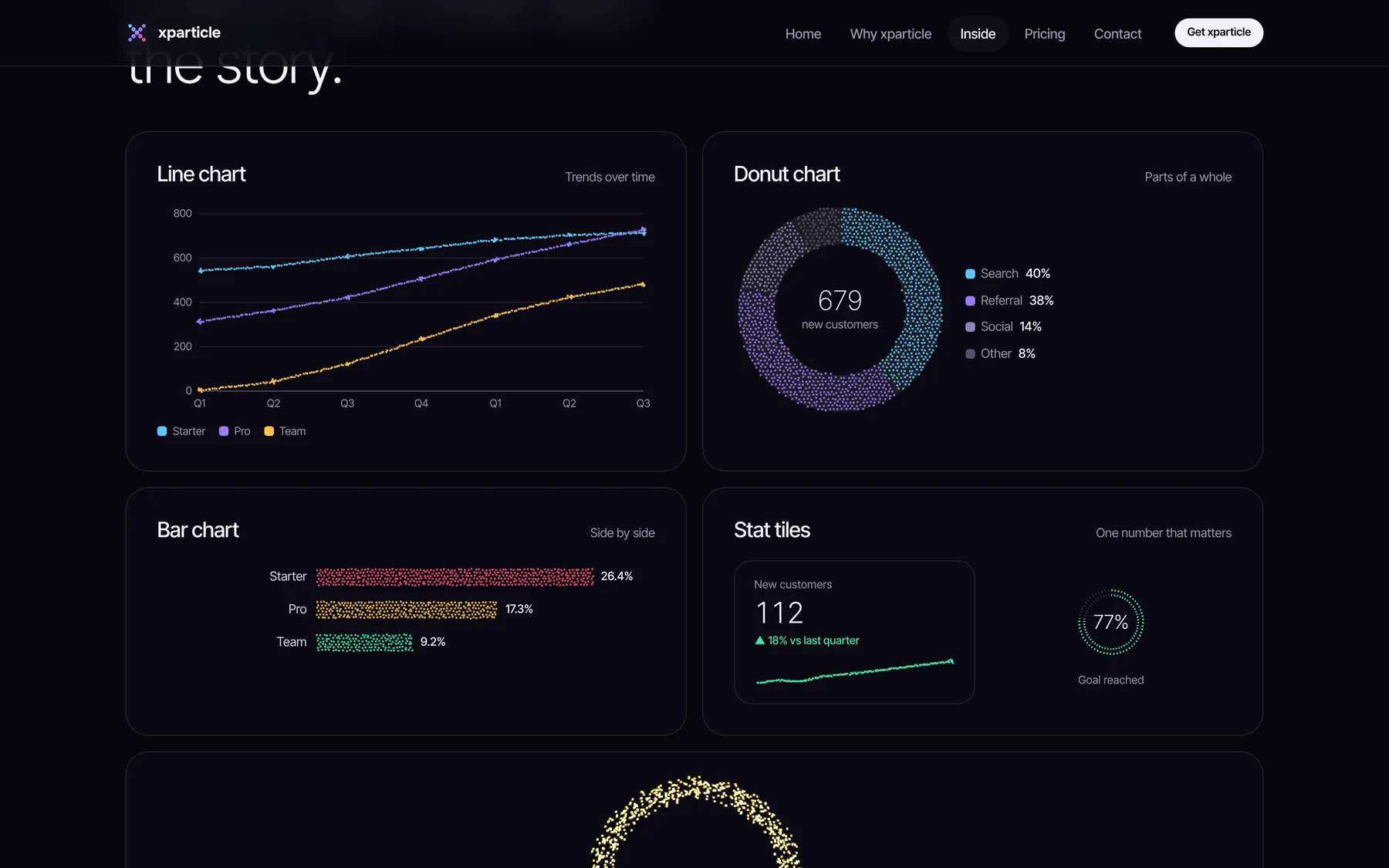
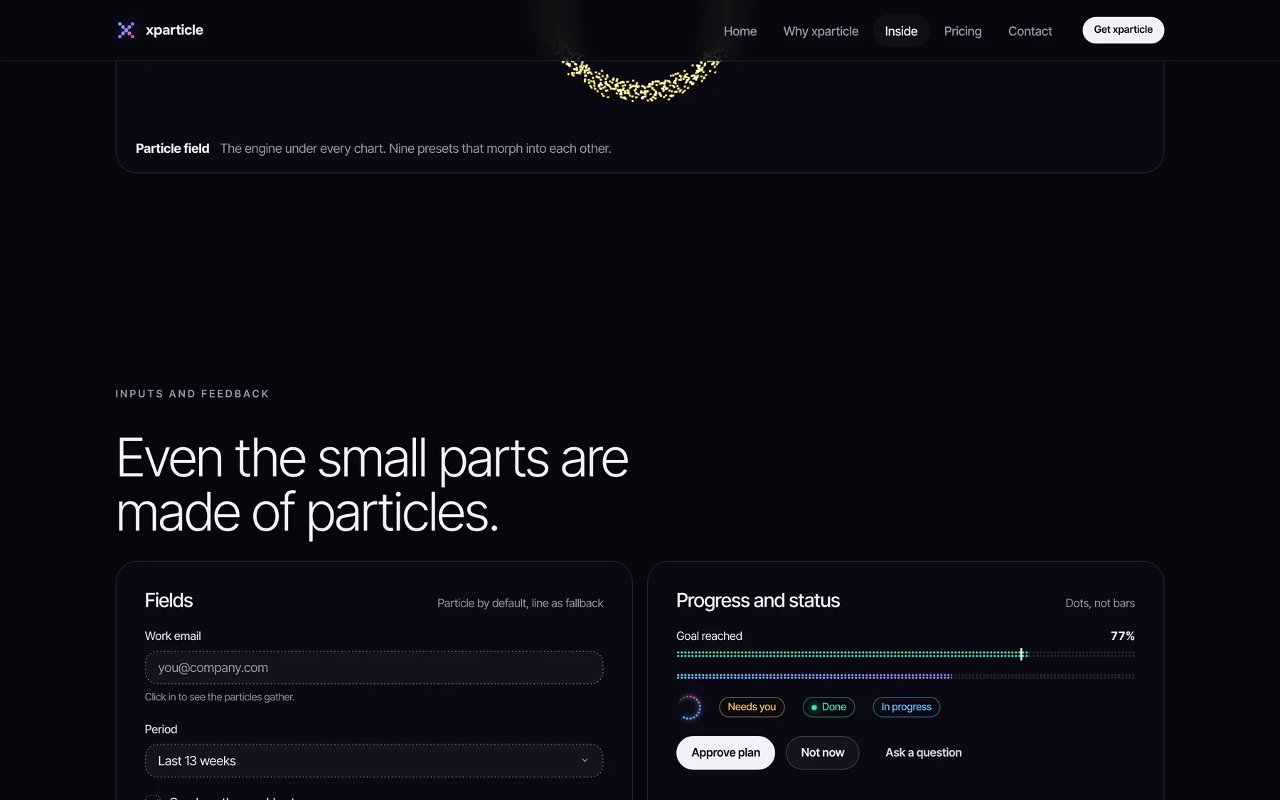
Positioning was honest on purpose: for a wall of twenty live charts in an operations room, the site tells people to use a regular dashboard kit.
Everything a team needs to ship the story, in any stack.
Inputs, overlays, navigation, feedback and data, each documented with real scenarios.
Line, bar, donut, funnel, treemap and more, nine presets that morph into each other.
Line by default, particles when you want them.
Dark and light, three densities and right to left, all following one brand colour.
Variables, styles, components and icons that match the code one to one.
Plain CSS and one small script. React, Vue, Svelte, Angular or a static page, no build step.
The system is ready for the way products and teams work now.
Coding assistants can read every component and token, so AI generated screens stay on brand.
A composer, streaming answers and a voice orb for products where people ask their data questions.
llms.txt and structured data so AI search can describe the product accurately.
The promises that make it safe to adopt.
Checked against WCAG 2.2 AA. Every chart has a label and a text fallback. Status always comes with words.
Reduced motion stops every particle, and a line style fallback exists for every input and data part.
One stylesheet and one script. Particles pause when they scroll out of view.
Right to left layouts, three densities and both schemes built in, not bolted on.
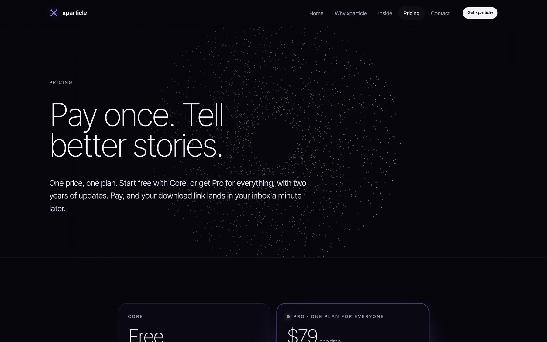
Free to try, one price to own. No tiers, no seats to count.
Same markup in both editions, so upgrading is a file swap. Design services sit on top: story screens, custom systems, product design and a design team on demand.
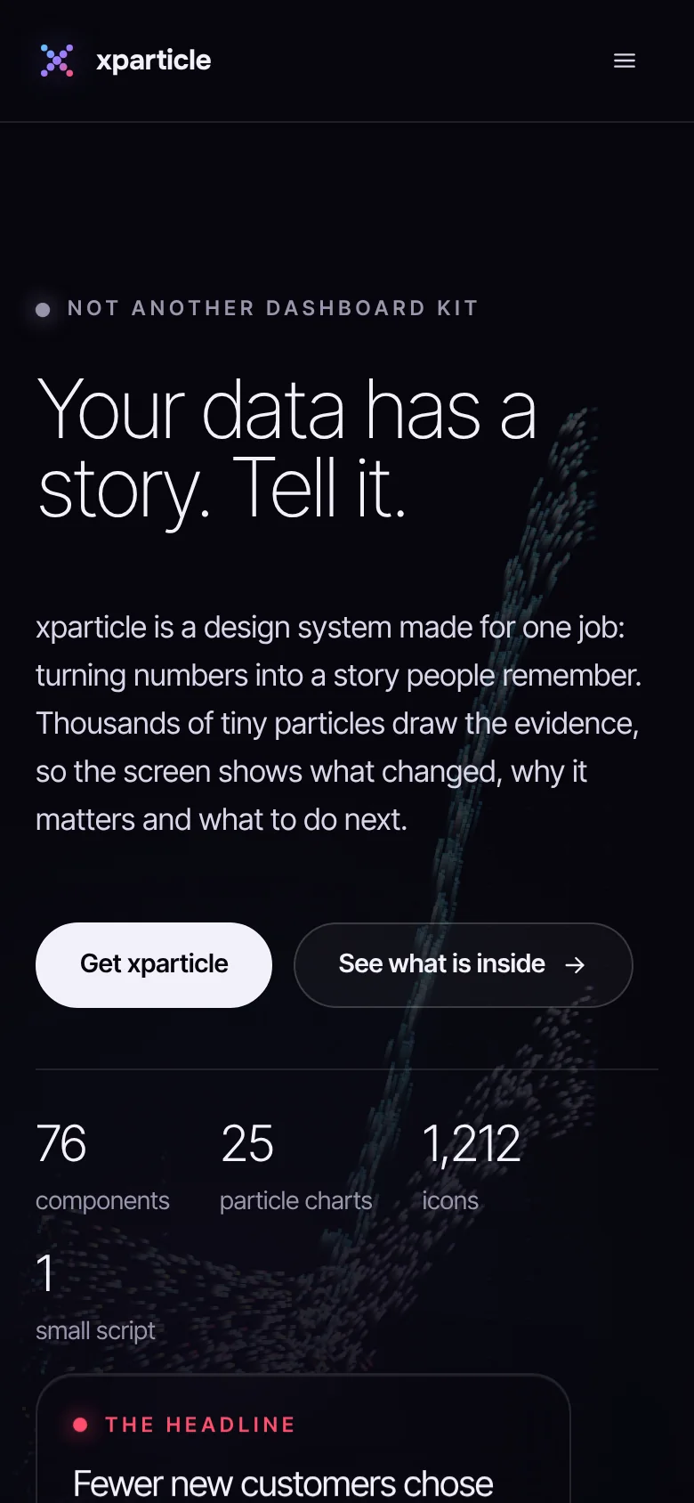
The story structure holds at every size: headline first, evidence next, decision last. Particles scale down and pause off screen to keep phones fast.
Saying who it is not for made it clearer who it is for: people who present numbers to other people.
Every animated part has a still, labelled version. Accessibility shaped the visual language, not the other way round.
Docs, Figma, pricing, licence and delivery are design work too. They decide whether a system gets adopted.
xparticle is a design system for data storytelling. Every screen leads with one headline and one number, shows the evidence as moving particles and ends with a decision someone can make.
76 components, 25 particle charts, 1,212 icons in line and particle styles, a Figma file, documentation and an MCP server for coding assistants.
There is a free Core edition and a Pro licence for a one time $79.
Yes. It targets WCAG 2.2 AA. Charts carry text labels so colour is never the only key, and particles hold still when motion is turned off.
Everything: the story structure, the particle visual language, tokens, components, icons, documentation and the product website.
Fix UX friction, design AI that users trust, unlock up to 5x growth. Get a free UX assessment.